I use the Plotly R libraries to quickly plot surfaces for identification of robustness. It’s a useful sanity check after reducing features to the most impactful ones.
The below illustrates a plot of “Keltner Deviation vs Keltner Period” data on the horizontal axes, with the vertical being the target performance score (in this case a simple Gain-to-Pain Ratio). The objective being that we want a high plateau, which indicates that even with some drift in the two features, we can still obtain a high performance score.
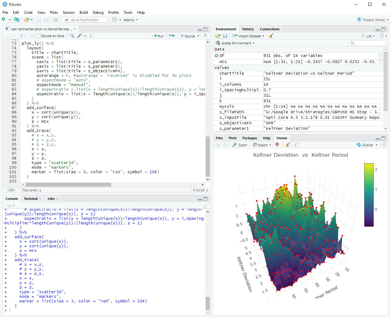
RStudio view
Running code in RStudio
R code
library(ggplot2)
library(plotly)

# string variables
s_filePath    <- "G:/Google Drive/Strategies/GBPUSD H1 Stop - 3.2.178/Analysis/multicurrency tests/"
s_inputFile   <- "opti Core 4.5 3.2.178 0.01 CADJPY Summary Report 2015-2018.csv"
s_parameter1  <- "Keltner Deviation"
s_parameter2  <- "Keltner Period"
i_columns     <- 14
s_ObjectiveFn <- "GPR" #options - GPR, Trades, Winners, Losers, Expectancy, NgRatio
i_SpacingMultiplier <- 0.7

# --------------------------------------------------------------------------------------------------------
#assign("chartTitle", paste(s_parameter1, " vs ", s_parameter2))
chartTitle <- paste(s_parameter1, " vs ", s_parameter2)

# select columns for read.table
mycols <- rep("NULL", length(read.table(paste0(s_filePath, s_inputFile), sep = ",", nrow = 1))) # create vector with length of number of columns in file

mycols[c(1:i_columns)] <- NA

# read csv values into data frame and name columns
df <- read.table(paste0(s_filePath, s_inputFile),
                 #header = F,
                 skip = 1,
                 colClasses = mycols,
                 col.names = c("x","y","z1","z2","z3","z4","z5","z6","z7","z8","z9","z10","z11","z12"),
                 sep=",")
head(df)
#tail(df)
#class(df)

# --------------------------------------------------------------------------------------------------------
# Add x, y, z data.frame column values to vectors
x <- df$x #this series (x co-ordinate) must be held constant until the next increment in the y series
y <- df$y #this series (y co-ordinate) must be the series that iterates immediately
if(s_ObjectiveFn == "GPR")       z <- df$z5
if(s_ObjectiveFn == "Trades")    z <- df$z6
if(s_ObjectiveFn == "Winners")   z <- df$z7
if(s_ObjectiveFn == "Losers")    z <- df$z8
if(s_ObjectiveFn == "Expectancy")z <- df$z11
if(s_ObjectiveFn == "NgRatio")   z <- df$z12

# --------------------------------------------------------------------------------------------------------
# create empty matrix with the required x and y bins
mtx <- matrix(NA, nrow=length(unique(y)), ncol=length(unique(x)))

# add the x and y address values
dimnames(mtx) <- list(sort(unique(y)), sort(unique(x)))

# add z values to the matrix
#mtx[cbind(y, x)] <- z #cbind here does not work with real numbers of y and x, have to fill matrix with loop, see below
k <- 0
for(i in 1:length(unique(x))){
  for(j in 1:length(unique(y))){
    k <- k+1
    mtx[j,i] = z[k]
  }
}

plot_ly() %>%
  layout(
    title = chartTitle,
    scene = list(
      xaxis = list(title = s_parameter1),
      yaxis = list(title = s_parameter2),
      zaxis = list(title = s_ObjectiveFn),
      autorange = F, #autorange = 'reversed' is disabled for 3D plots
      # aspectmode = "auto",
      aspectmode = "manual",
      # aspectratio = list(x = length(unique(x))/length(unique(x)), y = length(unique(y))/length(unique(x)), z = 1)
      aspectratio = list(x = length(unique(x))/length(unique(x)), y = i_SpacingMultiplier*length(unique(y))/(length(unique(x))), z = 1)
    )
  ) %>%
  add_surface(
    x = sort(unique(x)),
    y = sort(unique(y)),
    z = mtx
  ) %>%
  add_trace(
    # x = x_s,
    # y = y_s,
    # z = z_s,
    x = x,
    y = y,
    z = z,
    type = "scatter3d",
    mode = "markers",
    marker = list(size = 3, color = "red", symbol = 104)
  )
CSV data
opti Core 4.5 3.2.178 0.01 CADJPY Summary Report 2015-2018.csv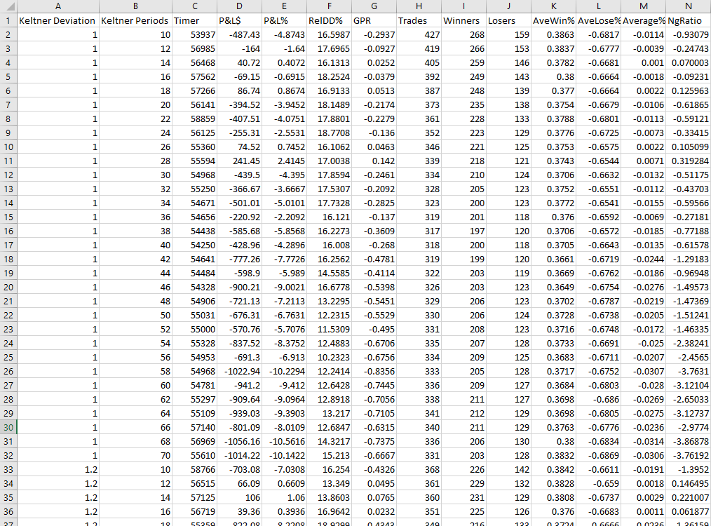
There’s actually much more to the selection of features; their parameters, the generation of the features themselves, the design of your objective function, issues on visualisation of more than 2 features, the use of genetic algorithms to shorten the search for the global high, which requires a redesign of the objective function that incorporates scoring of proximal values, etc.
It warrants another post and I might get to it in the next 3 years. In the mean time, you can experience the interactivity of a Plotly graph yourself here:
Hold left click and drag to rotate
Hold right click and drag to shift
Scroll wheel to zoom in and out
(You’ll need a competent graphics card else the animation will stutter as you drag it)
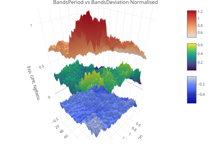
The plotting of 3 overlaid surfaces for each performance score does not really help. I did it for shits and giggles.

Discussion
No comments yet.