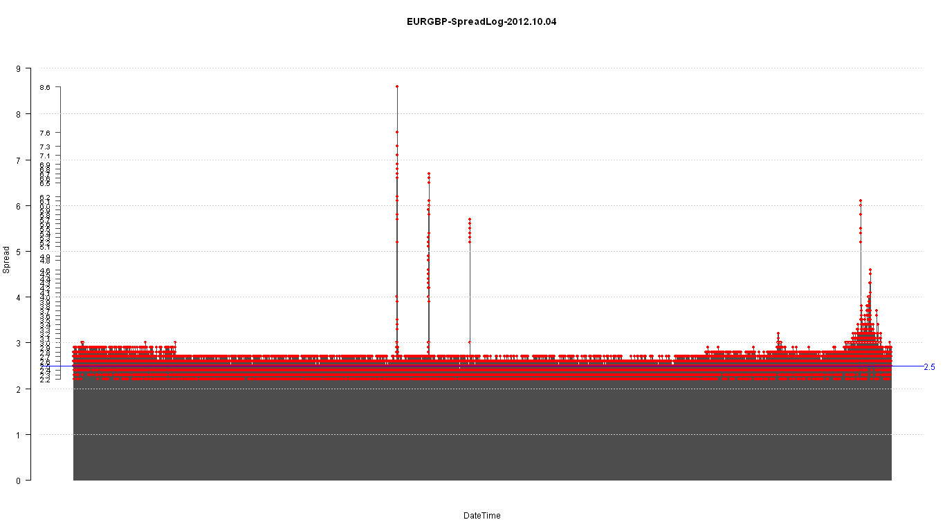
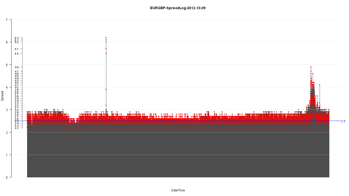
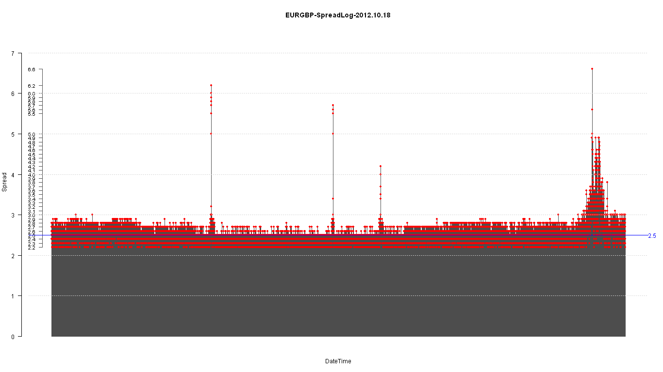
Here’s some simple plots of the EURGBP spread during the course of a day.
Initially tried to use Excel but R handles it much faster and leaner.
You can evidently see the spikes during news releases and a general increase as the liquidity drops during the Asian hours.
2012-10-07, 2012-10-14, 2012-10-21 are Sundays.

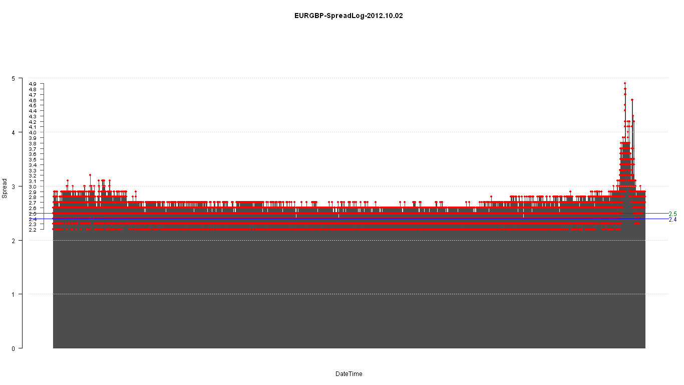
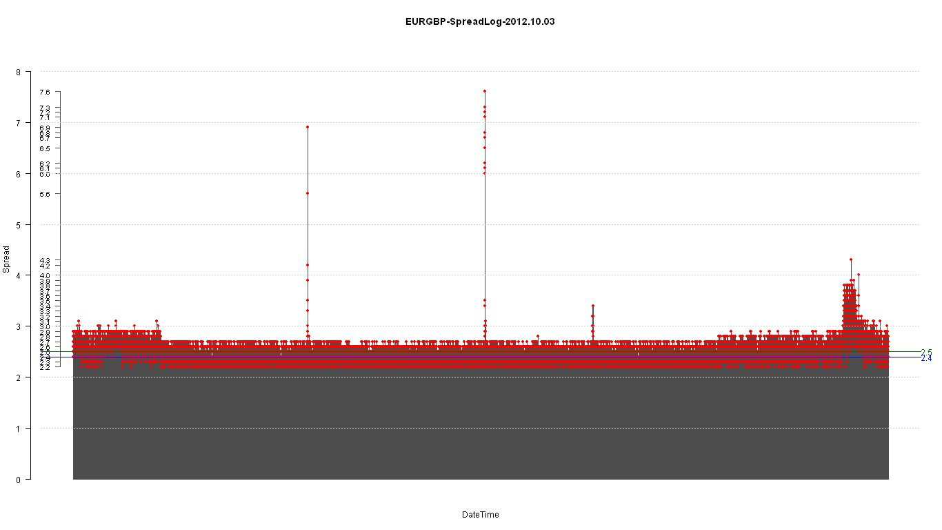


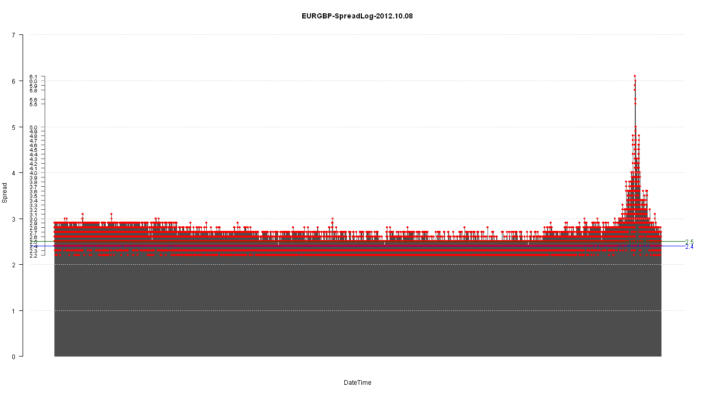
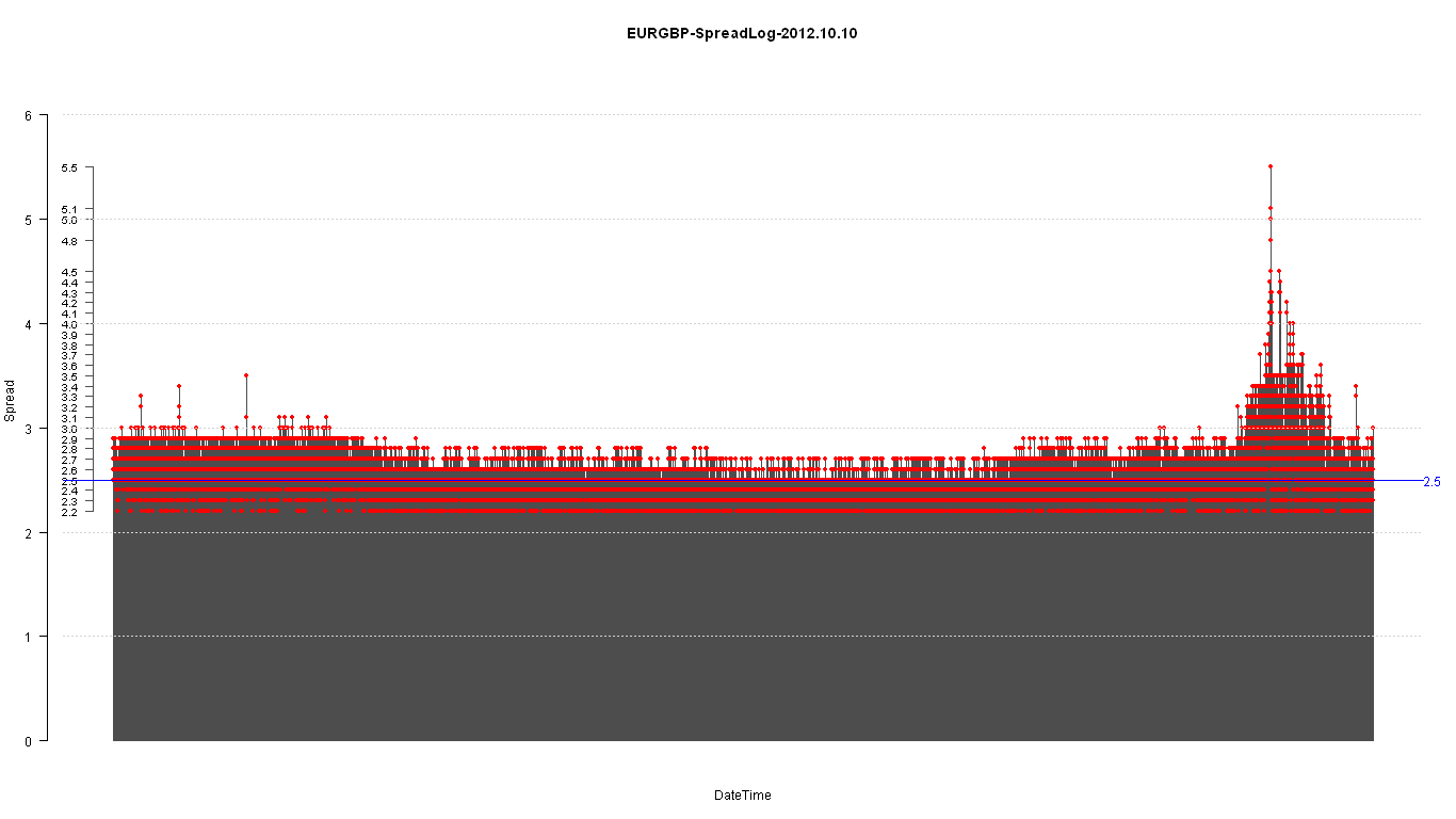
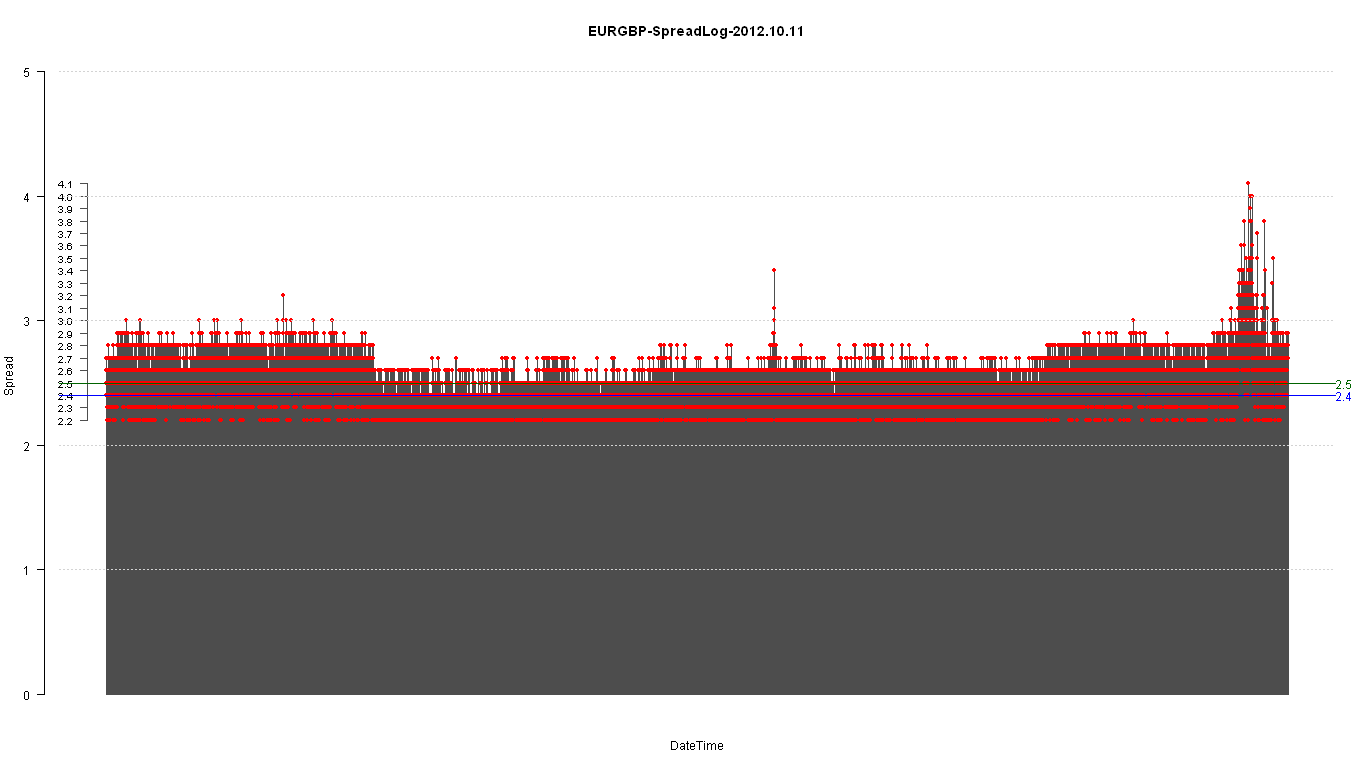


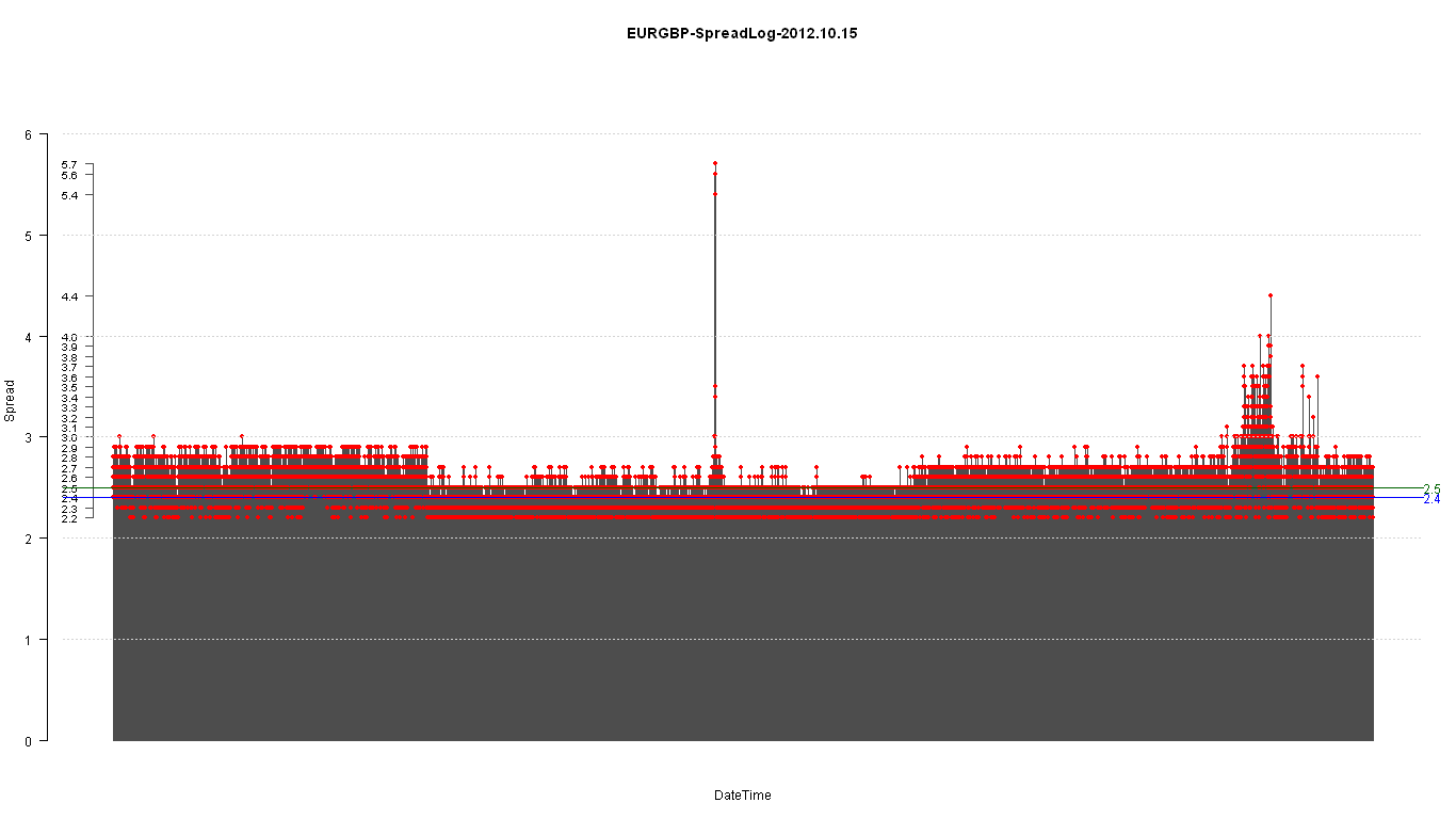


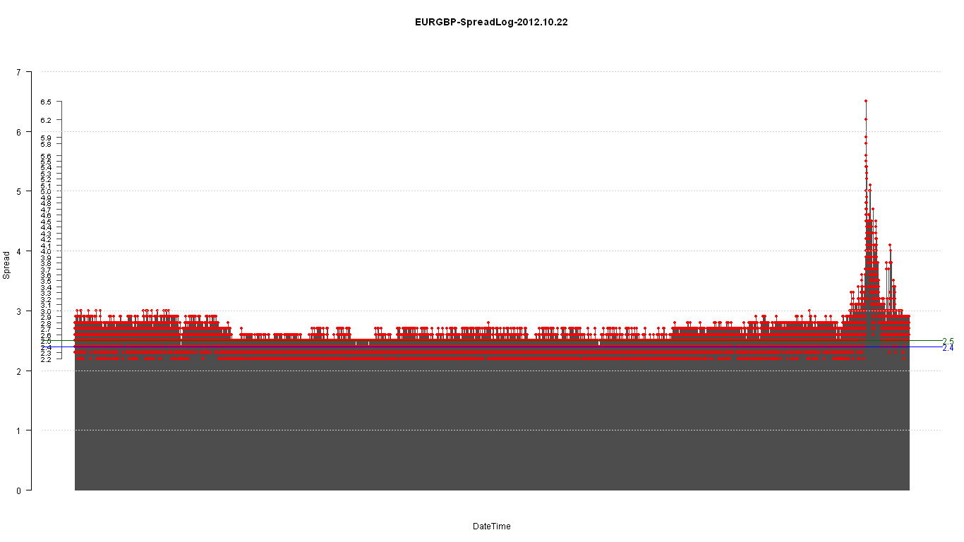
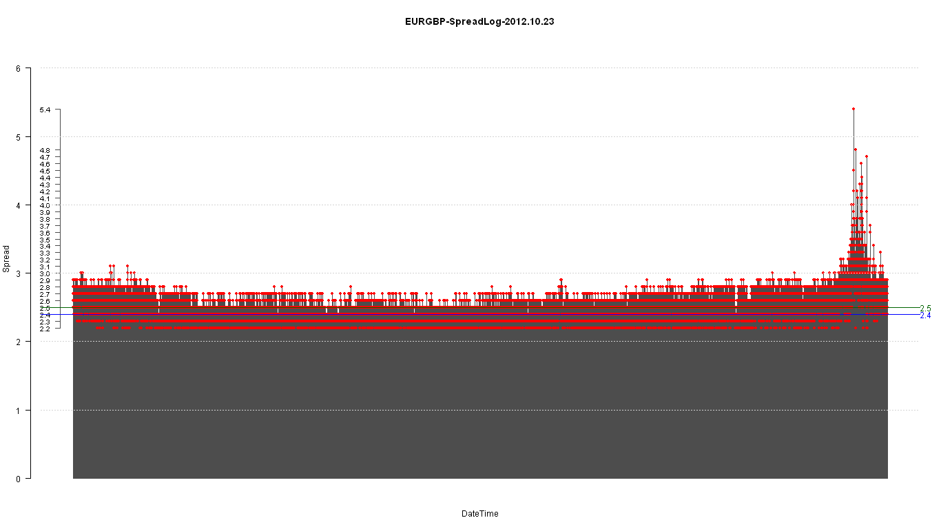


Green line is the MEDIAN.
Blue line is the MODE. (not in the R binaries base distribution)
#MODE function
statmod <- function(x) {
   z <- table(as.vector(x))
   names(z)[z == max(z)]
}

Discussion
No comments yet.